The Rise and Rise of Mobile
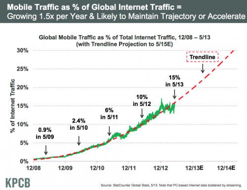
Have you ever been out to dinner, or in a bar with somebody who never stops checking their phone? Yes, we’ve all been there. Maybe we just need new friends? Recent figures have suggested that people with smartphones will look at them up to 150 times in a given day. Mobile devices have developed and continue to evolve, to deliver us the internet on the go and the time has never been more urgent for businesses to take a look at their email marketing strategy to embrace this.
Impact on email marketing
A recent study from the email marketing analytics people at Litmus showed that 47% of emails are opened on mobile devices, and a recent survey from RTE showed that there are 1.6 million smartphones in use in Ireland and estimated to be up to 450,000 tablets. This means that if your email newsletters are not being sent out optimised for these devices, then potentially up to half your outbound emails are not even being seen. Not to mention that 80% of people will delete an email that doesn’t display properly on their mobile device. These statisticss potentially take such a sizeable portion from your outbound mails that there really is no option but to consider and adopt responsive design to create a consistent email template that can be viewed across the board on smartphones, tablets & computers. Check out these 15 excellent responsive email templates for small businesses.
Some tips on designing for email newsletter for mobile
Keep it simple! Simplicity is key as the canvas you have to work with on a mobile device is much smaller.
Use Larger Text. Use less text and increase the size of what you do use.
No Waffle. Get to the point and state the main points of the email briefly and clearly.
Images. If you use images make sure they are used only for aesthetics and so that if a user views with the “Images Off” setting in their inbox, the message of your email still conveys. Also ensure that if using a responsive mail template, that any images are also responsive.
Subject Line. Avoid ambiguity & state your value propositions. Try to keep the character count under 35.
Call to Action: MUST BE PROMINENT & above the fold.

With the way people use the internet today, the design principal known as ‘Responsive Design‘ has become an integral component of any website. Being fitted with responsive design means that your website will render and display neatly and consistently across any type of mobile device; be it a smartphone, tablet or a traditional desktop computer or laptop.
With 1.6 million smartphones and 450,000 tablets in use in Ireland, not fitting responsively means not future proofing your website, and is cutting off your nose to spite your face in terms of reaching all of the potential users that would have otherwise be possible.
But what to do if your existing website is not responsive, you wish to make it so, and are considering your options. Let’s imagine you are in the less than ideal situation where your initial build was a big design project and that build did not include the foresight for mobile optimisation.
If you are in this position, there are a few options available:
1. Use a ‘Responsive’ CSS Stylesheet
This involves re-drafting your websites ‘stylesheet’ so that it will ‘stretch’ or ‘shrink’ to fit the particular viewing screen.
Pros
- This method involves using your existing code.
- This method will allow support across a large range of screen sizes.
Cons
- Responsive design is achieved using modern principals in CSS3. If your existing website is not styled with CSS3, this could prove very cumbersome.
- Trimming back some elements of the code and rearranging elements can take a lot of time to get right and also to test.
- The cost therefore would reflect the above points.
2. Use a Responsive Retrofit by adding an independent Responsive CSS file
This requires coding a separate mobile-friendly stylesheet, which will be activated when the site is viewed through a mobile device.
Pros
- This method also uses your existing code base.
- Since there is an independent stylesheet for responsiveness integrated, it will not interfere with the CSS design laid out for desktop.
- Cost to perform is reasonable if the existing sites coding framework adheres to good design conventions.
Cons
- The existing code base may lack flexibility or be somewhat incompatible with retrofitting
3. New Build with Responsiveness incorporated from the start
Pros
- This is the most flexible option in that it will ensure that your site displays correctly across all device screen sizes and is fully optimized for each.
- It is future proofed for new devices
- It gives your website and you a great image
Cons
- It requires going “back to the drawing board” somewhat.
- It requires new planning and strategies.
- It would be the most expensive option
Summary
As should be apparent, there are a lot of factors to consider when making the decision to adopt responsive design. Each case of course is subjective and can depend on your needs as a client and of course your budget. In an ideal world we would always recommend going for option 3 and reinventing the site with responsive design built in from scratch, but nevertheless it stands to reason that some sort of mobile accessible site is better than none.
That said, bearing in mind also that it is sometimes more logical and less cumbersome to completely rebuild, the key point to take from this blog is that each case is subjective and each set of pros and cons must be thought out clearly, in order to expand your site to mobile devices in accordance with your budget.
– Sean at enhance.ie

Lots of predictions of what 2013 will bring on the web. For enhance.ie we would predict some of the key changes will be in the area of Mobile, and Responsive design in particular, no big surprise there as it seems to be trending at the moment…
Find out more about what we can offer in the areas of Mobile and Responsive Design
SEO
There is three elements to Search Engine Optimisation (SEO):
- Structural SEO
- On-Page SEO
- Off-Page SEO
The web build or development is all about structural SEO. It is imperative that the website is structurally built to with optimisation guidelines in mind. This is the first foundation or building block associated with website development. We would recommend building a new website on a content management system that is structurally optimised to the hilt! For example, WordPress is a highly optimized content management system (CMS) and performs very well search engine rankings. However some web agencies have developed their own CMS platforms, for example the team here at enhance.ie have developed a tailored CMS which on par with WordPress in terms structural SEO. So make sure you address the different options in terms of content management systems with your choose agency or developer.
Online Strategy
Here at enhance.ie we come across a lot of clients who are ignorant to the fact that a website is only a small part of a bigger picture. Too often, the detrimental factor when deciding what agency or route to take in relation to a web build, is PRICE. However we feel it is imperative to understand that a website is part of an overall online strategy. I would recommend going with an agency or other party who is willing to offer the whole package and create a lasting relationship.
More often that not you will run into some technical difficulties and need to call on a reliable source, a committed agency will be able to offer the guidance and advice you need. We deal with a lot of clients who are left in the lurch by a rogue developer who has vanished off the face of the earth. This is a reoccurring theme in our industry. So do not let the price be the significant or only factor determining your choice.
Goals
When approaching a web design agency or developer with your proposed web build ensure that you have a clear picture of what goals you want the website to achieve. Many people and businesses set up a website for the sake of going online and really do not know what they want the website to achieve. Here at enhance.ie we advise our clients to identify at least three clear goals to accompany the web creation request. Example of website goals would be:
- build brand awareness
- increase revenue
- increase footfall to offline store etc.
Ideally you should be able to work with your agency on developing and tracking the progress of your goals. Furthermore we would recommend discussing conversion strategies with your agency or developer during the web build. For example if you are a service provider and your main action button on the website is ‘request a quote’ – ask your agency about different conversion strategy tests (e.g. A/B testing) and how you can improve these rates together.
Content Management System
The Content Management System (CMS) that your website is built on will be an important element to your online progress. When you are discussing the different CMS options with your web design agency or developer make sure you trial the CMS and see if you like the look, feel and overall functionality of it. The agency should be willing to give you a quick demo or guide. WordPress is World’s favorite CMS. Originally WordPress was built for blogging and the blogging community i.e. content people, non-techies. Therefore the usability and accessibility has always been at the forefront of the WordPress development. The content management systems we offer here are at enhance.ie are similarly built to allow users to easily update, edit and maintain their website.
Focus
Focus is a crucial aspect of any website development project. Everyday here at enhance.ie we have calls from different people (‘entrepreneurs’) who have a fantastic idea and want to know if we can make it happen for them. More often than not the individual has done very little market research and wants to offer a web solution to everybody and anybody. The features and functions are sometimes endless. So my advice here is too make sure that you know your target market before you decide to build the website and do not try to cram everything into the intial build. Tailor the features and functions back to ensure that the core of website is built correctly and runs smoothy. Remember the modern day CMS is extensible and new features and functions can be added to the website when necessary.
Communication
Finally the last but certainly not least is communication. It is imperative that you remain in constant contact with your agency once the web development process has started. Web agencies have a vast amount of clients and your web development progress could easily be hindered by other projects. Once you have chosen web design agency or developer the key to progress is constant interaction. Make sure that you stay in constant contact with your account manager and make an effort to provide them with everything they need ASAP. For example if you receive a wireframe or design sample make sure to give instant feedback to move onto the next stage.
