
 In a world of ever changing screen sizes and resolutions it is getting harder for companies to cope with making sure their website looks good on various displays such as large desktop monitors, laptops, netbooks, tablets and smart phones. Many companies turn to creating separate mobile versions of their websites so users can quickly gain access to the most important information. This however may not suit every company, some companies will need to have everything on show and they will want it to display well to everyone no matter what device they are using.
QUICK LINKS
Why use a Responsive Design Website?
Up until recently, most websites had been designed for viewing on desktops and laptop computers. However, with the growing popularity of mobile devices, it has become apparent that…….
How to Make Your Website Mobile Friendly
With the way people use the internet today, the design principal known as ‘Responsive Design‘ has become an integral component of any website. Being fitted with responsive design means that your website will render and display neatly and consistently across any type of mobile device……
The Rise of Mobile II – the B2C numbers
Our own research on teh growth in mobile from 2010 through to 2013 makes for interesting reading…..
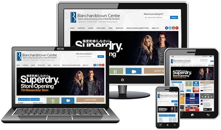
This is where responsive design can help. Responsive design is the approach that the page design and layout should respond to the users behaviour including whatever screen size, platform and orientation the user is using. It involves the use of flexible grids and layouts, images and clever use of CSS media queries.
For example when a user switches from their desktop computer to their iPhone the website would automatically change to allow for the different resolution. Images would resize, the navigation may change and blocks of text wrap under each other. In other words the website would respond to the users choice of device, thus eliminating the need for other device specific design and development.
